
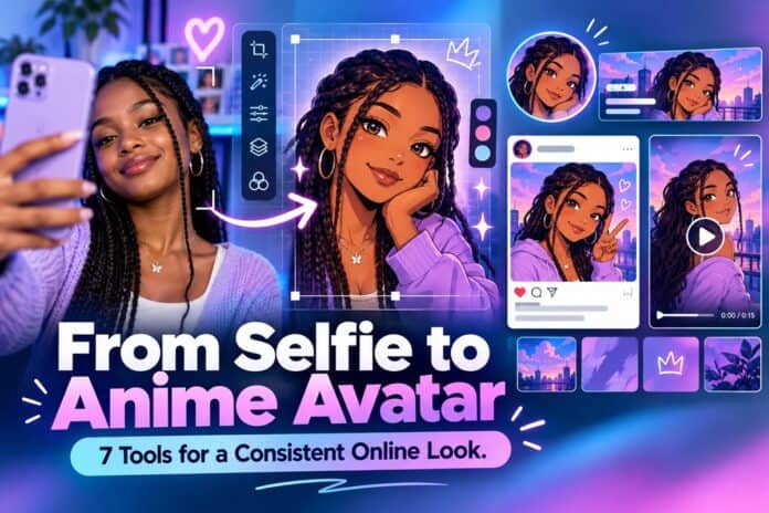

An anime avatar can make a creator profile instantly recognizable. The difficult part is not producing one attractive image. It is keeping the same face, colors, and personality when that image becomes a tiny profile icon, a channel banner, a post, and a short introduction video. An effect that looks convincing at full size may turn into an indistinct blur in a circular crop.
This guide treats a selfie as the start of a small design system. The seven tools below do different jobs: create the character, separate it from a busy background, correct details, prepare a larger version when needed, fit it into layouts, add motion, and publish a coherent set. You do not need all seven for a single avatar. Use the steps that match the places where your image will appear.
Before You Edit: Choose a Photo You Can Use
Start with a well-lit image in which the face is visible and the hairstyle is not lost against the background. A clear source gives you a better reference for judging whether an anime interpretation still looks like you. Avoid heavily filtered selfies: if the original has already changed the shape of the face or eyes, the next transformation has less reliable detail to preserve.
Use your own photo, or get permission from the person pictured. If the image is for a public creator account, decide in advance how closely the character should resemble the source. List two or three details to protect, such as hair shape, glasses, a favorite jacket, or a specific color palette. That short list becomes the test for every revision. It also keeps a photo-to-anime portrait from drifting into a generic character.
7 Tools, From Anime Portrait to Published Profile
The order follows the asset, not a ranking of which company is best. First settle the character. Then prepare clean files for different placements. Only after the artwork holds up in those placements should you animate or schedule it.
1. Flova: Establish the Character
The first job is to turn the source image into a character with a deliberate style. A fixed filter may be quick, but it can change the very features that make the portrait recognizable. Write a brief that names the subject, the intended mood, and the details that must remain. “Warm evening light, simple linework, keep the round glasses and short curls” is more useful than simply asking for “anime style.”
The Flova Image to Anime Converter lets you describe that look in natural language and identify the facial or clothing details you want to keep. Review the result at both full size and avatar size. If the face is right but the background competes with it, request a focused change rather than rewriting the entire brief. Save a preferred version and the original photo separately so later edits do not erase your reference.

An AI anime avatar is a visual interpretation, not evidence of how someone looks in real life. That is fine for a creative profile, provided the context is clear. Once the character itself works, the next question is whether it can survive a different background.
2. Remove.bg: Isolate the Character for Other Layouts
A scene that works as a standalone portrait may be awkward on a banner or thumbnail. If you need the character on a colored card, remove.bg can create a transparent-background cutout from the approved image. Keep the original scene too; the cutout is a separate asset, not a replacement for everything Flova produced.
Inspect the outline before using it. Fine hair, glasses, and shadows are common places to look for missing or unwanted fragments. A fast cutout is useful only if it does not make the character look pasted onto the next layout. A simple solid background may work better than transparency for a tiny profile icon. When the automatic cutout needs help, move into a manual editor instead of cycling through more generators.
3. Photopea: Make Small, Controlled Corrections
Photopea is a browser-based image editor with layers and masks. Use it for problems that are easier to fix directly: a rough cutout edge, an awkward crop, a stray mark, or the space around the subject. Preserve a layered working file and export separate copies for each use.

Do not treat every odd-looking detail as a retouching task. If an eye, hand, or defining accessory has changed substantially, revisit the original character image. Manual edits are best for finishing a strong result, not disguising a weak one. At this point you should have a clean master portrait and, if needed, a transparent version. The next challenge is size: a file suitable for a small icon may not hold up on a wide header.
4. Upscayl: Prepare a Larger Version When Needed
Upscayl is a desktop image upscaler. It can be useful when you want to test the approved illustration in a larger layout without starting the artwork again. Work from the cleanest available export, and compare the enlarged file with the original at the size people will actually see.
Upscaling cannot recover detail that was never there. It may sharpen lines while subtly changing eyelashes, lettering, or small accessories. Keep the original as your reference and reject any enlarged version that makes the character less consistent. For a compact avatar, you may not need this step at all. Its place in the workflow is conditional: use it for a banner or large post only when the existing master looks soft at the final display size.
Now that the portrait is clean and large enough for its intended placements, turn it into a recognizable set rather than scattering unrelated crops across accounts.
5. Adobe Express: Build the Profile Set
Adobe Express provides layout tools and templates for social graphics. Start with a small kit: one avatar, one channel cover, and one post format. Use the same approved face, two or three colors, and one type style across them. That consistency matters more than filling every frame with effects.
Design for the frame each platform actually shows. Profile images are often cropped to a circle; keep the face away from the edge and preview the result at small size. Banners may be cropped differently on phones and desktops, so keep important text near the center. Put captions and handles in editable layout text rather than asking an image generator to draw tiny words into the picture.
An anime-style profile image should still be readable beside ordinary posts and comments. If a layout looks good only when enlarged, simplify it. The static set is now ready; motion should introduce the same character, not invent a second identity.
6. CapCut: Make a Short Introduction
CapCut is useful for assembling a brief introduction from your finished stills. You could open with the avatar, reveal the wider illustrated scene, and end on a clear account name. Use modest movement, readable captions, and audio you have the right to use. A few intentional seconds can communicate more than a stack of transitions.
Check whether the video remains understandable without sound. Avoid implying that a moving photo is a live recording of the person if it is actually an illustrated creative piece. Compare the first and last frames with the static avatar: the hairstyle, colors, and overall tone should feel like the same identity. Export a version that fits the channel where it will be posted, then keep the original project so you can change a handle or caption later.
The files are complete. The final job is to release them in a way that makes the profile feel deliberate rather than changed overnight by accident.
7. Buffer: Publish the Pieces in a Coherent Order
Buffer can help plan and schedule social posts across connected channels. Use it to introduce the new look in a simple sequence: update the profile image and banner, publish a post explaining the creative refresh, then share the short intro. Write a caption that tells people what the illustration represents. If the account also shares real photographs, make that distinction obvious.
Scheduling is not a substitute for checking each live placement. Some profile fields still need direct updates in their native apps, and a scheduled post may crop differently after publication. Preview the artwork on a phone, inspect the first live post, and adjust the next asset if the face or text gets cut off. Measure whether the new look helps people recognize and engage with the account, but do not claim that a style change alone caused any increase.
The Final Consistency Check
Put the original portrait, approved character, avatar crop, banner, post, and video still next to one another. Ask three questions. Does the character remain recognizable? Does each file fit its real display space? Would a new visitor understand that the illustration is a creative identity rather than a documentary photo?
Keep a master copy of the source image, the approved artwork, and the editable layouts. Record the colors and a few defining features in a short note. That makes the next post easier to produce without rebuilding the character from memory. If an edit changes the face too much, return to the approved master instead of allowing each new file to drift further away.
For a one-off avatar, Flova and a careful crop may be enough. The other tools earn their place when the character needs to work across several formats. Treat the seven steps as a menu, not a shopping list: keep the tools that solve a visible problem, and let the finished profile look like one person with one clear visual idea.