I have seen enough branding stories to know that a logo is never “just a picture.” It’s a mirror of a company’s soul, its strategy, and how it speaks to the world. When Facebook became Meta, I watched the rebrand unfold with both curiosity and a critical eye. This article explains why the Facebook (Meta) logo evolved the way it did, what each design step means, and how these lessons can shape your own branding decisions.
The Early Days: From Facemash to “TheFacebook”
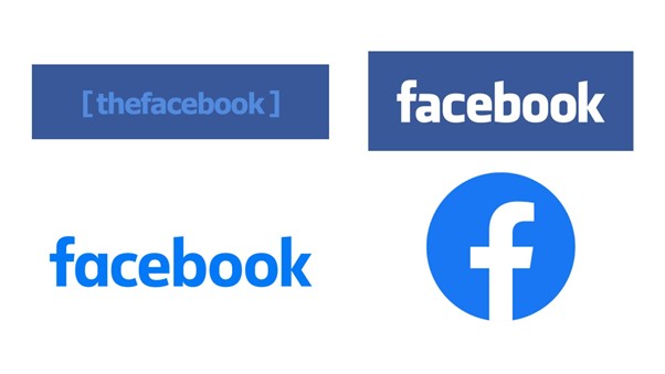
The origin of Facebook’s visual identity goes back to Mark Zuckerberg’s early project, Facemash, launched in 2003. The first logo had little to do with professional branding – it was just a playful representation for a student project. When Facebook emerged in 2004 under the name “TheFacebook,” the logo was a simple wordmark in white lowercase letters, placed on a blue background.
Why blue? According to interviews, Zuckerberg is red-green colorblind, which made blue an accessible and vibrant choice. But beyond that, blue is a color often associated with trust, security, and professionalism, exactly what an emerging social network needed to build credibility.
Klavika Font and Facebook’s Brand Maturity
The shift from “TheFacebook” to “Facebook” marked a new phase of the brand’s identity. The wordmark was refined using Klavika, a geometric sans serif font. Its clean lines made the platform appear reliable and modern.
Over time, the logo underwent subtle refinements. Letter spacing, shapes, and proportions were optimized for digital screens. The iconic lowercase “f” icon was introduced as a standalone symbol, an instantly recognizable monogram that worked across apps, websites, and advertising banners.
Flat Design and Mobile-First Evolution
As the digital world embraced minimalism, Facebook moved toward a flatter, simpler design language. The gradient-heavy logos of the 2000s were replaced with flat, clean shapes. This transition aligned with mobile-first design principles – a critical factor as Facebook became a leading mobile app.
I noticed that many small businesses make a similar mistake: they keep complex logos that don’t adapt well to small screens. The Facebook rebrand was a clear lesson in digital adaptability.
Expert Tip: Always test your logo in mobile conditions. A design that looks perfect on a website header can lose its identity when reduced to an app icon.
The Transition to Meta and the Infinity Symbol
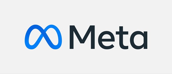
In 2021, Facebook announced its corporate rebrand to Meta, signaling a shift toward building the metaverse. The Meta logo is a continuous infinity loop – a symbol of limitless creativity and connection. Its smooth curves and abstract shape speak of evolution, not just a name change.
From a branding perspective, Meta needed to distance itself from the controversies linked to Facebook while keeping trust and familiarity. The infinity logo does exactly that: it suggests openness and continuity without relying on legacy shapes or typography.
Key Lessons for Business Owners
Studying Facebook’s evolution reveals three strategic branding insights:
- Logos evolve with the company’s vision – your visual identity must match your long-term goals.
- Simplicity drives recognition – flat shapes, clean typography, and consistent color use make a logo memorable.
- Cultural and emotional signals matter – colors like blue can subtly communicate trust, while shapes like infinity suggest innovation and inclusivity.
Creating a Logo Inspired by Leading Brands
If you’re building your own brand, you can draw inspiration from how Facebook and Meta approached design. A well-crafted logo is not about copying but about aligning with your brand values. Modern tools, including AI-driven platforms, make this easier than ever.
With an AI logo generator, you can create designs that resonate with your audience and reflect current trends in branding. Such tools allow quick experimentation with colors, fonts, and shapes – without hiring a professional designer.
Visual Timeline of the Facebook and Meta Logos
This kind of timeline helps illustrate not just aesthetic changes but also the strategic shifts behind them – from a student network to a global social platform to a visionary metaverse company.
Common Branding Mistakes (and What Meta Did Right)
Many companies make the mistake of overcomplicating their logo redesigns. Facebook’s approach, in contrast, was measured: small refinements over time rather than radical, confusing changes. Each step was data-driven and user-tested.
Another common misstep is ignoring scalability. Meta’s infinity symbol works as well on a VR headset as it does on a business card. This is crucial for modern brands operating across multiple platforms.
Frequently Asked Questions (Q&A)
- Why did Facebook choose blue for its logo?
Blue is a color associated with trust and reliability. Mark Zuckerberg’s colorblindness also made blue the most accessible and distinct choice. - What does the Meta infinity symbol represent?
It stands for unlimited possibilities, creativity, and the vision of a connected metaverse. - Should small businesses update their logos as often as big brands?
Not necessarily. Frequent redesigns can confuse customers. Focus on meaningful updates aligned with your company’s growth and vision. - Is it worth using an AI logo generator for a business logo?
Yes, if speed and budget are priorities. AI tools provide customizable templates and inspiration while maintaining a professional look.
Final Thoughts
A logo is more than a visual tag; it’s an emotional trigger that shapes how your brand is perceived. The story of Facebook and Meta proves that thoughtful evolution can strengthen brand identity over decades.
If you’re at the stage of creating or refreshing your own logo, consider starting with AI-powered design tools like Turbologo. These solutions let you experiment, test, and refine your brand visuals while keeping control of the creative process.


